History
Pareto Analysis gets its name from the Italian-born economist Vilfredo Pareto (1848-1923) who observed that a relative few people held the majority of wealth.
Dr Joseph Juran was the first to point out that what Pareto had observed, was a universal principle. More specifically, that in any group of factors contributing to a common effect, a relative few account for the bulk of the effect.
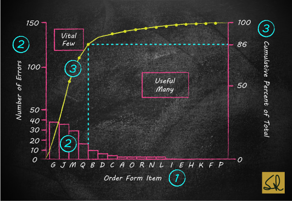
Further, Dr Juran coined the terms vital few and useful many to refer to those few contributions which account for the bulk of the effect; and to those many others which account for a smaller proportion of the effect.
Examples
As experienced managers and professionals, we intuitively recognize the Pareto principle and the concepts of vital few and useful many.
For example, we might observe that:
Recommendation
If the Pareto principle is so obvious and so simple, then what is all the fuss about it?
If we really understood the simple but profound Pareto principle, our first step, when faced with a flood of problems, would be to gather data and facts to identify the vital few problems. Refer Quality Capsule 014.
Thereafter, we could then focus our attention and improvement efforts on those few things that would give us the greatest improvement in quality. Refer Quality Capsule 005.
Pareto Diagram of Errors on Order Forms
Insight
Try converting the left-vertical axis to COPQ; and then observe how senior managers embrace quality improvement! Refer Quality Capsule 004.
Next
In my next edu-blog, on Wednesday 21 October, I will introduce Histograms, for univariate analysis.
Even as a stand-alone tool, a Histogram can lead to breakthroughs in purchasing departments, as well as key customer facing processes in hotels, hospitals, airports, etc.
Histograms also highlight COPQ.
© Copyright 2026 - CAHO - All Rights Reserved
Web Design & Development : Interactive Bees

